15+ examples of minimalist white and kraft packaging done right
Minimal, check. Impact, check. One color and cost-effective, check.
A product shines best when its packaging is pared back. A simple single colour white ink print on kraft is one way to achieve that.
Get inspired by these stunning packaging box examples of white ink printing on kraft – designs that evoke quality, refinement, and class with a pared-back aesthetic. What’s not to love?!
Inspired to create something similar? Check out our newly released white and kraft box mockups here and make those designs a reality!
Soleca Planedo / Book collection by Carolina Aboarrage
Eastern Facial Specialist Packaging by @workbyworks
Fig & Palm Packaging by @brianbrianliu
Hencho packaging by paseo.studio
Classic Zara shipping cartons
Tangerine & You by AURG Studio
Grupa packaging by Bunch
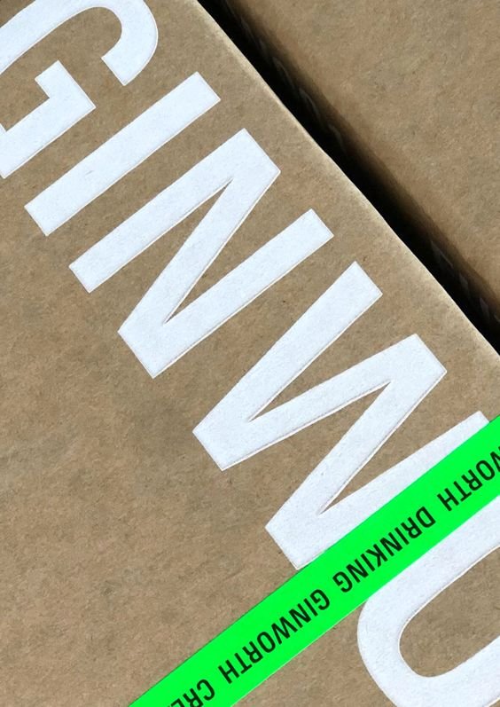
Ginworth by M35
Artfull by Studio South
Bianca Sciuto by Both
Our Box04 mockup example featuring a spray painted inspired print pattern. Shop the mockup here.
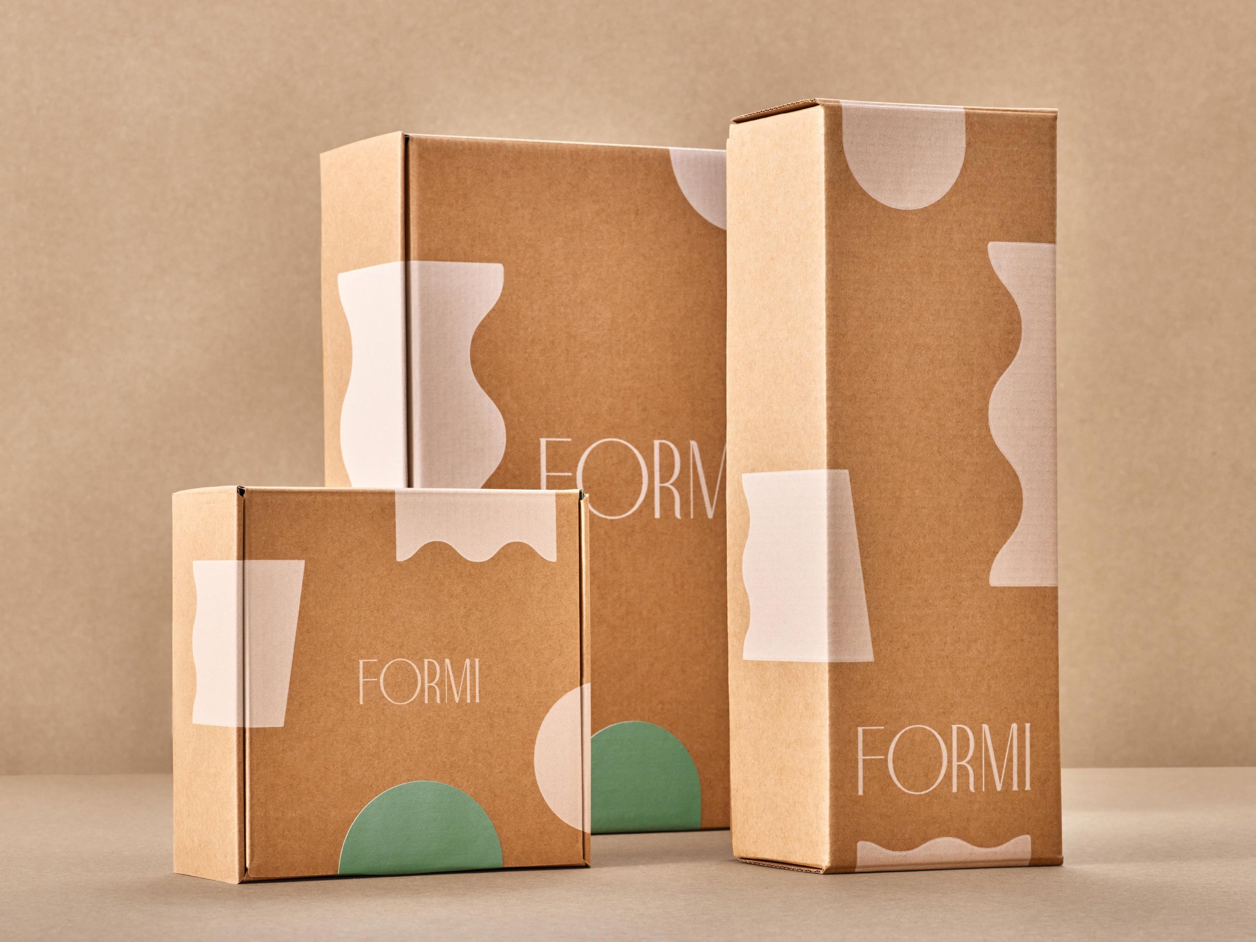
Cul-de-sac Creative’s design for haircare brand, Formi.
Delamar by Parametro Studio
Grean by Studio Vacarme
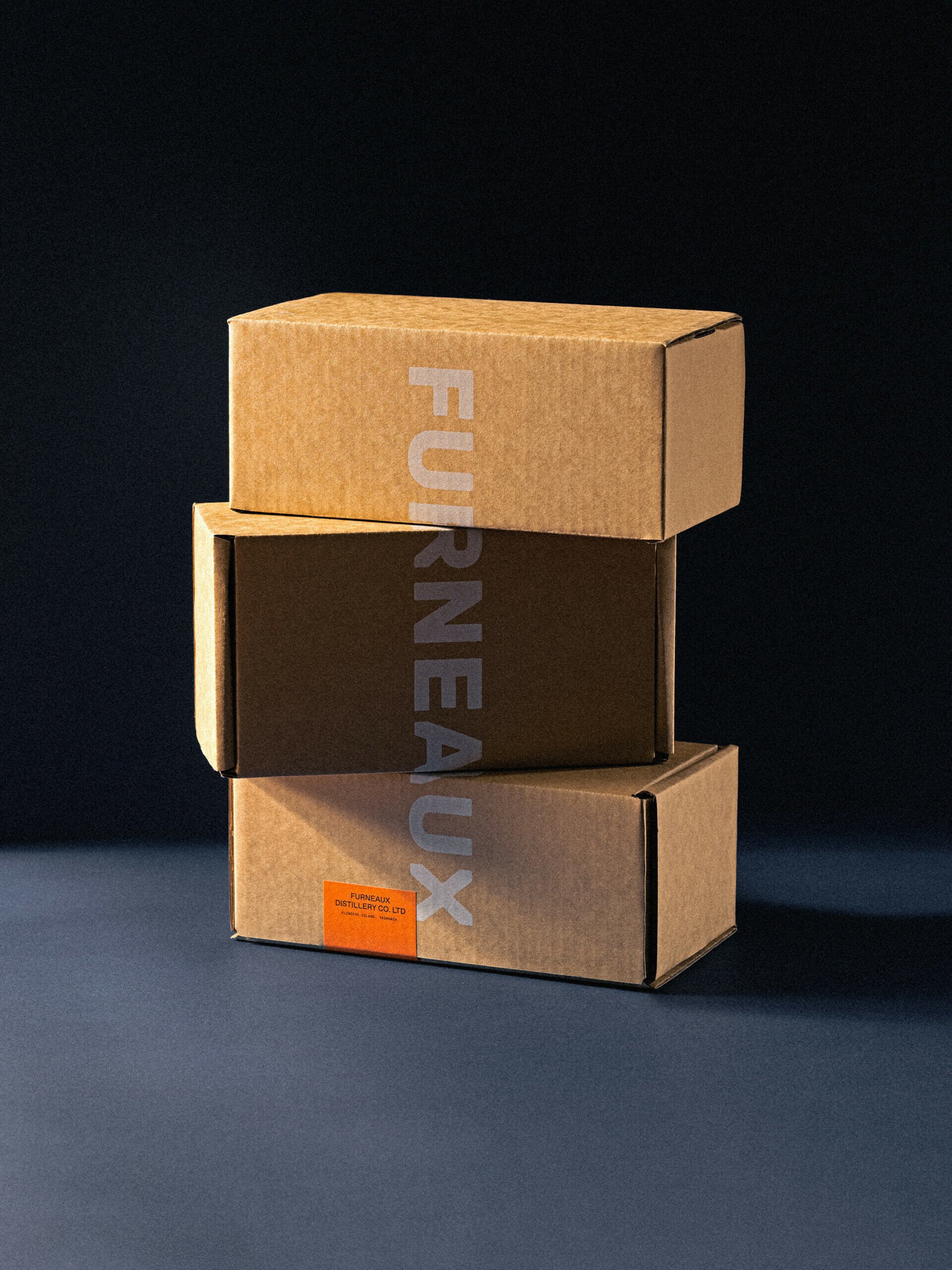
Furneaux Distillery by Swear Words
Mjolk Packaging
Loeffler Randall packaging
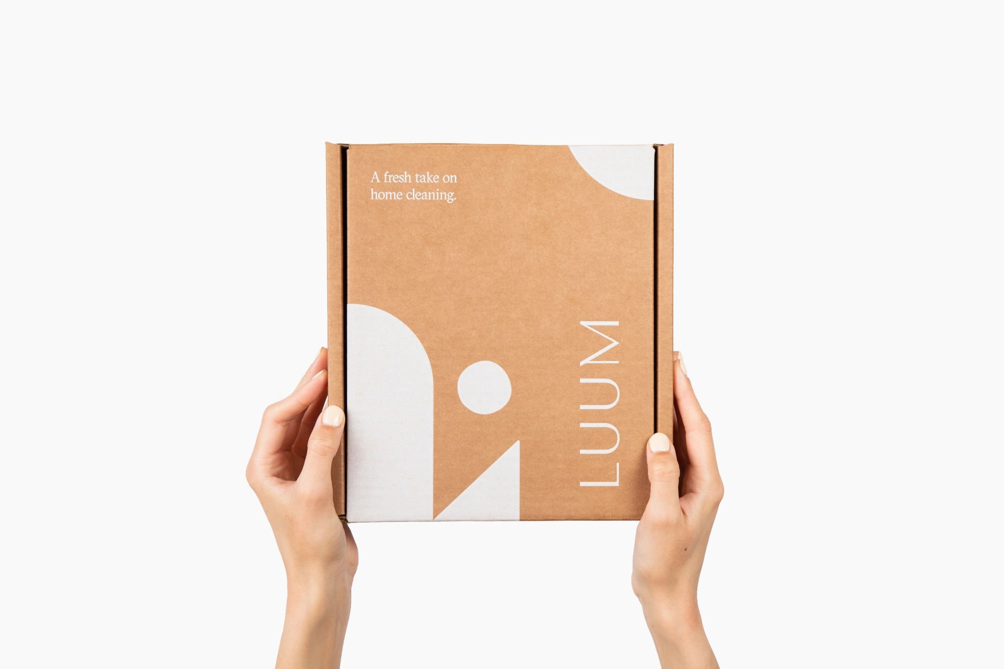
Luum by Wayfarer Design Studio
Let’s Wine by @batseoul
GoodGut concept design by us and brought to life using our Box03 mockup!


